
Fraunces is a display, "Old Style" soft-serif typeface inspired by the mannerisms of early 20th century typefaces such as Windsor, Souvenir, and the Cooper Series. Fraunces was designed by Phaedra Charles and Flavia Zimbardi, partners at Undercase Type.
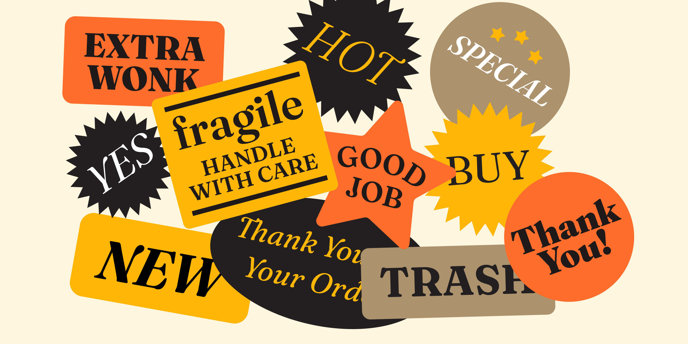
Fraunces is a Variable Font with four axes: Weight (wght), Optical Size (opsz), Softness (SOFT), and Wonky (WONK). The Softness axis controls the “wetness” or “inkiness” of the typeface. The Wonky axis controls the manual substitution of “wonky” characters, such as the lean of the h, n, and m glyphs in the Roman, and the flagged ball terminals of the b, d, h, k, l, v, and w glyphs of the Italic.
To contribute, please see github.com/undercasetype/Fraunces.
Fraunces is a variable font that offers a variety of styles for text and display typography.
In 2018, Google Fonts commissioned Flavia Zimbardi and Phaedra Charles of Undercase Type to make a new display typeface that would demonstrate the power and promise of variable fonts with a sense of humor.
Their solution to this challenge is inspired by the early 20th century typefaces such as Windsor, Souvenir, and the Cooper Series.
“Fraunces probably leans a little more (pun intended) towards the mannerism in Windsor than any of the others, but they all have some qualities common with each other. Those typefaces were meant to evoke a hand-drawn quality more appropriate for display advertising. The leaning ‘n’ in Windsor is a very distinctive characteristic of this style and is probably the most direct comparison. Fraunces does something unique by creating a design space that incorporates both heavy inky qualities, as well as thinner, more refined and delicate qualities seen in the lighter weights of Windsor. The italic pairing for Fraunces is also very distinct and draws influences from Cooper Nouveau, which blends Art Nouveau influences,” said Phaedra Charles.
Using variable font technology gives more flexibility; Fraunces embraces the new variable font technology with four axes–softness, weight, wonk, and optical size–making it much more versatile and customizable than any typeface released in the 1970’s.
To learn more, read Wonky, goofy, playful, elegant and a workhorse: Meet a new breed of “Old Style” typeface.