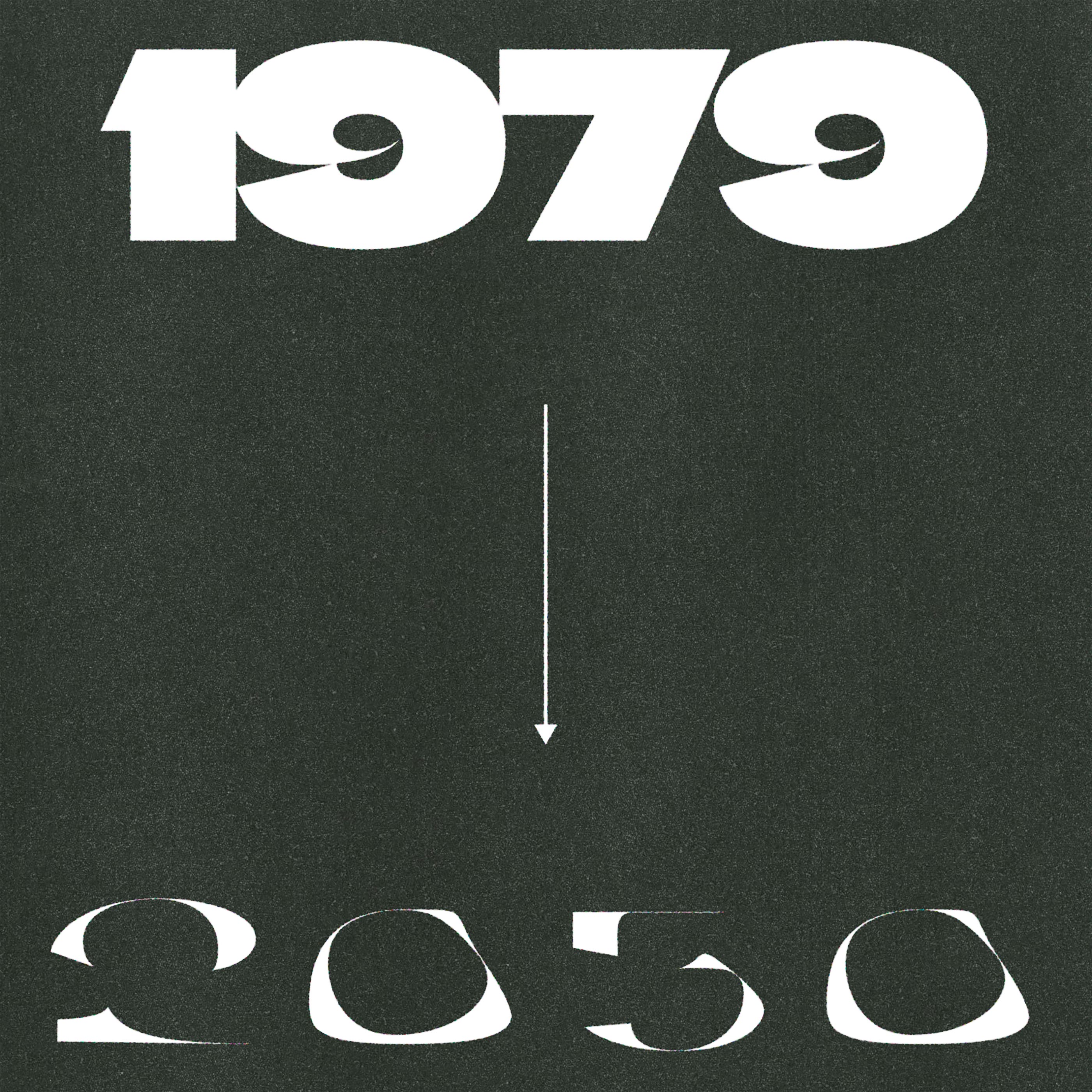
Climate Crisis, is a variable font designed to help visualise the urgency of climate change, designed for Helsingin Sanomat, the largest Nordic newspaper. The typeface’s weight responds to the levels of Arctic sea ice from 1979 to 2019 and predictions for 2050, based on data from the National Snow and Ice Data Center.
Case study on the mini website.
To contribute, see github.com/dancoull/ClimateCrisis.

As mentioned in the recent article about the Tilt family, Google Fonts is adding a bunch of new expressive variable fonts and axes to the library. Check out the latest release, Climate Crisis.
Climate Crisis, with its new variable axis called Year, was commissioned by the Nordic newspaper "Helsingin Sanomat" to use in its own editorial and marketing. It visualizes the urgency of climate change by appearing to degrade over time, like each character is a glacier melting away. More than just a metaphor, the font reflects actual data from the National Snow and Ice Data Center to represent the levels of Arctic sea ice from 1979 to 2019. Satellite measuring began in 1979. Predictive data from The Intergovernmental Panel on Climate Change (IPCC) is used to visualize the ice melting through 2050.
The typeface's designers, Daniel Coull and Eino Korkala included eight masters for the Year axis. (When type designers create a variable font, they need to embed masters at each extreme end of a variable axis, but often they embed multiple masters along the axis in order to give the in-between instances more finesse.) The heaviest weight represents the Arctic sea ice in 1979. The lightest weight represents the IPCC's 2050 forecast, when only 30% of the ice will remain.
To learn more, read:
Show your type melting over time like a glacier with Climate Crisis and its Year axis.