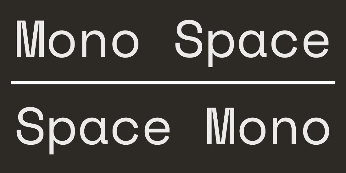
Space Mono is an original fixed-width type family designed by Colophon Foundry for Google Design. It supports a Latin Extended glyph set, enabling typesetting for English and other Western European languages.
Developed for editorial use in headline and display typography, the letterforms infuse a geometric foundation and grotesque details with qualities often found in headline typefaces of the 1960s (See: Microgramma, Eurostile), many of which have since been co-opted by science fiction films, television, and literature.
Typographic features include old-style figures, superscript and subscript numerals, fractions, center-height and cap-height currency symbols, directional arrows, and multiple stylistic alternates.
Colophon Foundry is a London and Los Angeles-based digital type foundry established in 2009. Its members comprise Benjamin Critton (US), Edd Harrington (UK), and Anthony Sheret (UK). The foundry's commissioned work in type design is complemented by work in editorial design, publishing, curation, and pedagogy. Visit colophon-foundry.org
To contribute ideas and feedback, see github.com/googlefonts/spacemono

As designers of type, we most often find ourselves composing a monospaced (sometimes called a fixed-width, fixed-pitch, or non-proportional) typeface in the service of building out the styles of an accompanying proportional type family or type system. It’s about adapting the proportional type’s forms and rules, and discovering how those letterforms behave within fixed limits to give the face new texture and capability. But what if that constraint was embraced? What if we set out to create a monospaced typeface that wasn’t simply an extension, but rather something unto itself?
To learn more, read Introducing Space Mono a new monospaced typeface by Colophon Foundry for Google Fonts.