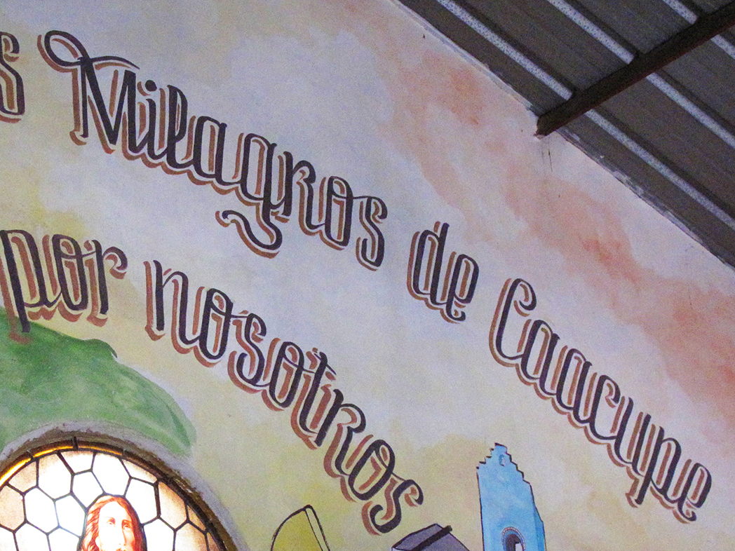
Caacupé is a condensed, heavy display typeface rooted in the street lettering of Villa 21-24, one of the largest villas, or working-class urban neighborhoods, in Buenos Aires, Argentina, and home to a large Paraguayan community.
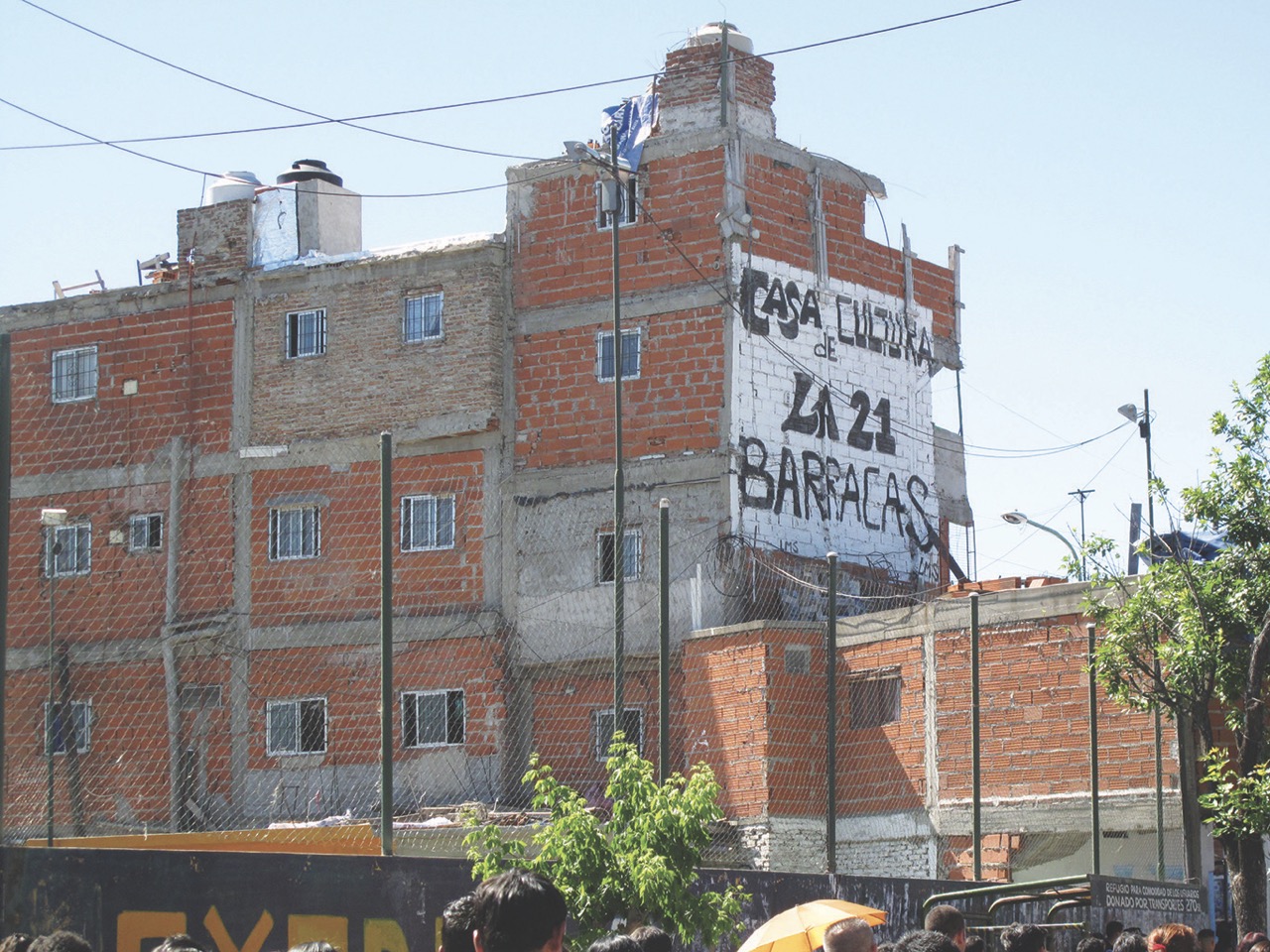
The typeface began in 2014 as a piece of field research rather than a commission. Instead of asking how type should look for such a neighborhood, the project asked what its visual language already was. The answer was on its walls: hand-painted, brush-lettered shop signs, where letters work as images before they work as text, and where a message has to catch the eye at a glance to exist at all. A parallel study of the newspapers circulating in the area found the opposite: publications set in technically correct but culturally distant typefaces, designed for the neighborhood rather than from within it.
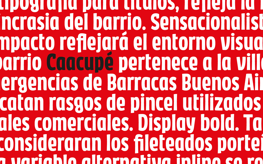
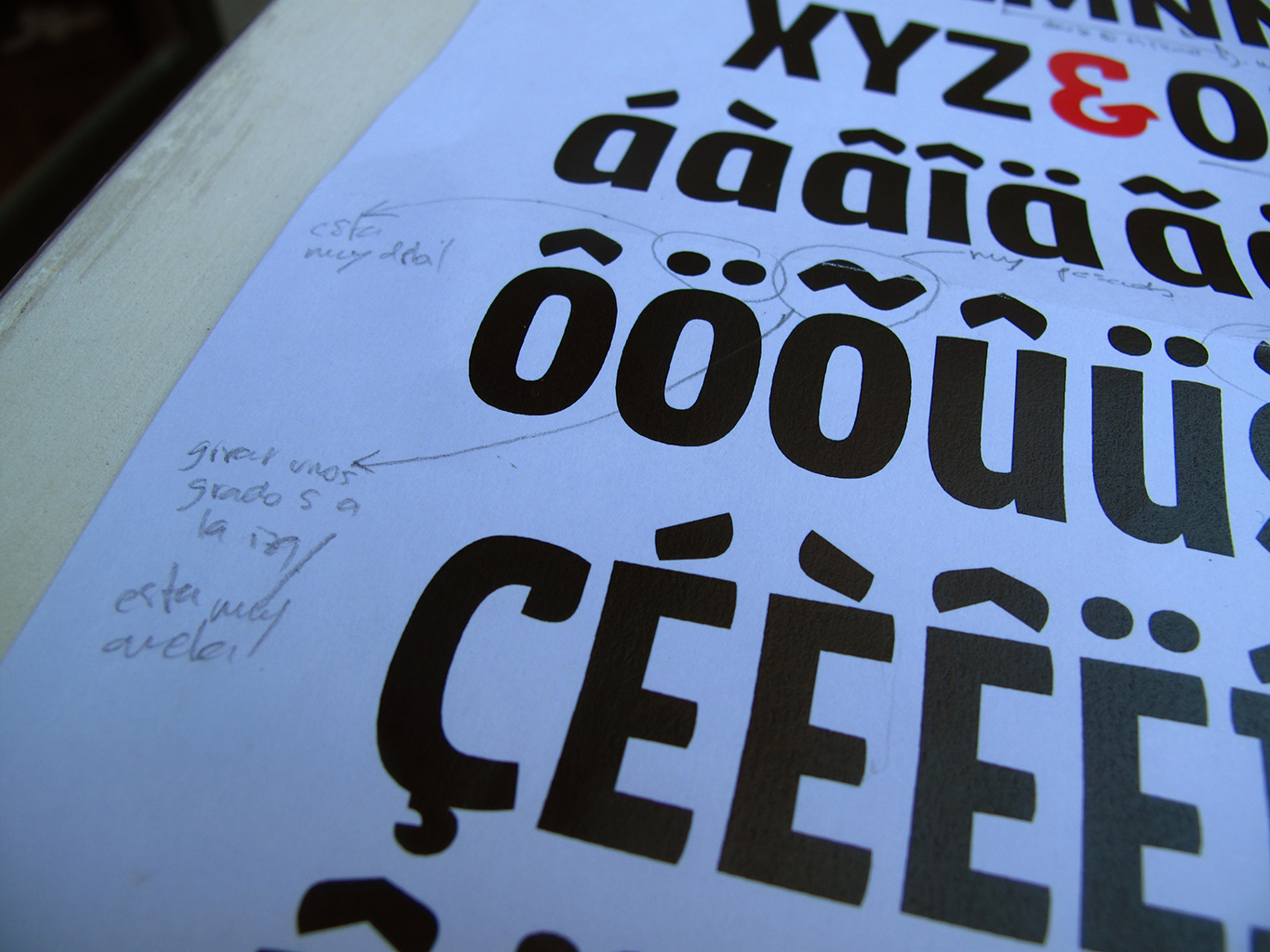
Caacupé translates that vernacular into a working typeface. It is a grotesque sans serif with low contrast, short ascenders and descenders, a generous x-height and a deliberately heavy color, built for headlines and short text at large sizes. Its terminals carry a subtle hint of the brush, a quiet trace of the painted signs it descends from, rather than a literal imitation. Details observed on the street, from the prevalence of uppercase to the hand-drawn flourishes of local sign painters, informed its decisions as the design moved from paper sketches to digital form. The result is a face made to speak loudly and clearly: direct, dense, and full of presence.
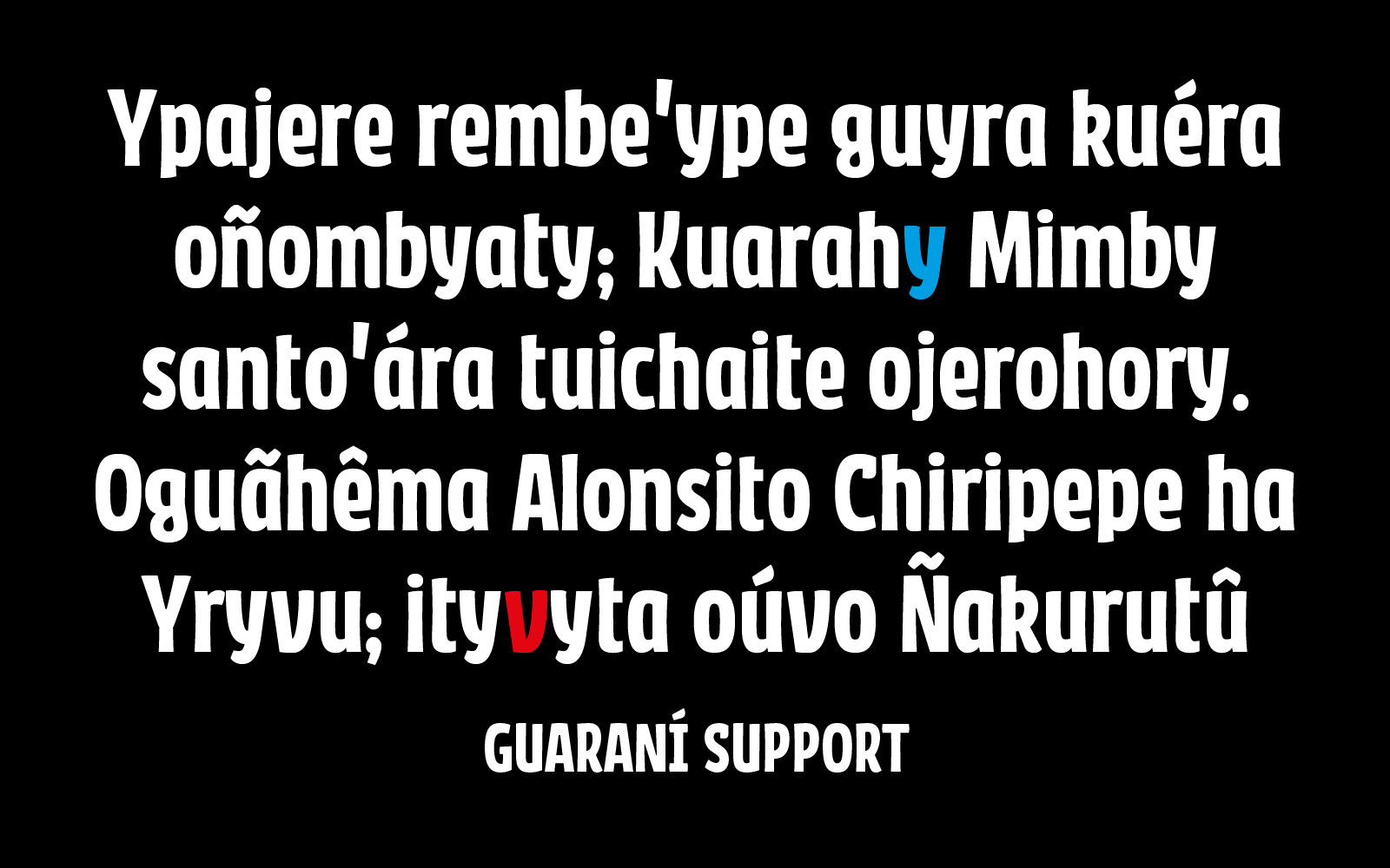
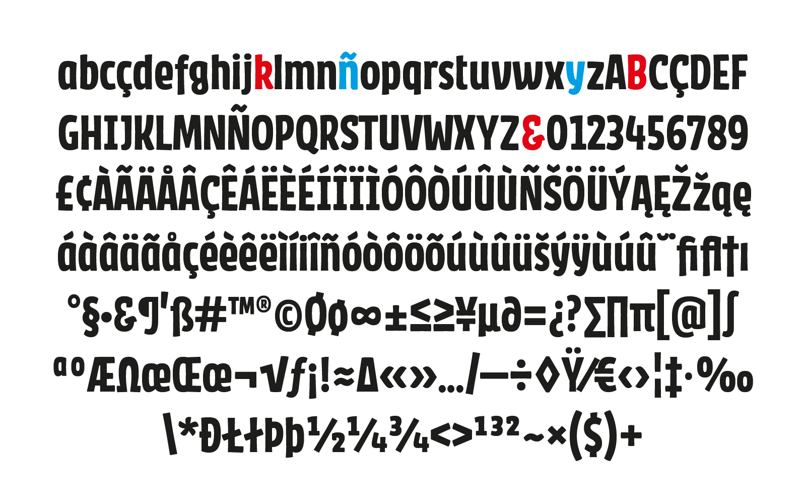
Language sits at the heart of the project. The neighborhood is home to a large Paraguayan community, and Guaraní is a first or second language for many residents. Caacupé was drawn with that reality in mind, giving particular attention to the letters that recur most often in Guaraní such as "y" and "v", and to the marks the language needs, so that Guaraní text reads as naturally as Spanish. The typeface also includes broad Latin coverage, spanning the full Spanish set, extended Latin, currency symbols, fractions, mathematical signs and ligatures.
Caacupé is currently available in a Bold weight. Released under the SIL Open Font License, it aims to give a formal, open and freely available voice to a vernacular that rarely finds its way into type, and to stand as a small counterexample to the habit of designing for people whose context we have never looked at closely.
To contribute, see github.com/googlefonts/caacupe.